Recent Posts
- Home
- Printing & Design Tips
- Printing Black - Creating True Rich Black and When to Use It
Printing Black - Creating True Rich Black and When to Use It
Posted on
Have you ordered marketing materials and been disappointed that the black looks dull or more faded than your digital proof? This is a common frustration and it’s caused because the graphic designer chose ‘100K’ black in the design program. This is a common mistake and happens when you do not include other colors from the CMYK palette to create black that will be printed.
What you were expecting and looking for is what’s known in the printing industry as “rich black” or “true black”. This is the black that you expect, but is elusive and often unknown amongst inexperienced designers. Clash Graphics designers can inspect and adjust the graphic files so your printed materials are produced with the deep black you expect. Here are some important tips about creating the rich black you’re used to seeing on computers, digital proofs and mobile devices.
When to Use Rich Black
Rich black is best used in large chunks when you have a large black area that uses a liberal amount of black or has a black background. It’s also good to use true black when you’re working with leaflets, brochures, posters or materials displaying large fonts. Another suitable application of rich black is when you have a lighter background and want a darker color on top to contrast well. Sometimes a printer will get confused and mix the regular black with the background, which can let the background show through. Using rich black eliminates this problem and gives that bold true black you expect.
When to Avoid Using True Black
Not all situations call for rich black. You should avoid using true black when you are working with small patches of black or small type. It’s also important to avoid using rich black when you work with newspapers. Using a rich black on paper like newsprint can cause it to bleed and compromise the structure of the paper.
How to Create True Rich Black
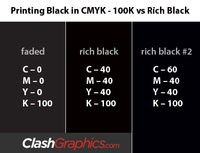
Now that you know when it’s best to use rich black, you should know a few CMYK formulas to create it. You must use the CMYK color mode profile in the design software to ensure a true black. There are actually a few mixtures to produce a rich black; these are two popular CMYK settings.
The first is to mix 40% Cyan, 40% Magenta, 40% Yellow, and 100% Black or K which results in (40, 40, 40, 100 – CMYK). Some designers may choose to leave the yellow out, but it helps balance the other colors out. The difference may be subtle to the naked eye, and results may vary if you use different printing companies.
The other way to create a rich black is to mix 60% Cyan, 40% Magenta, 40% Yellow, and again 100% Black (60, 40, 40, 100 - CMYK). At Clash we use this mixture as it creates a more neutral rich black. In CMYK 240% is pretty much the limit with color mixing. If you want to adapt the above mixture to your own liking, remember you will need to lower the percentage of one color to increase that of another color.
When you experiment creating rich blacks you will understand how these 4 CMYK values affect one another and find a perfect mixture of your own. As there are 4 color variables in a CMYK color mode, there are many ways to create rich black. The common mixtures listed above may not be right for your project, but these are good models that will produce a deep black. Don’t be afraid to make your own CMYK combinations and find your favorite mixture.
Quick Links
Atlanta, GA 30309